HTML: Make a Web Design Responsive for All Devices With Examples
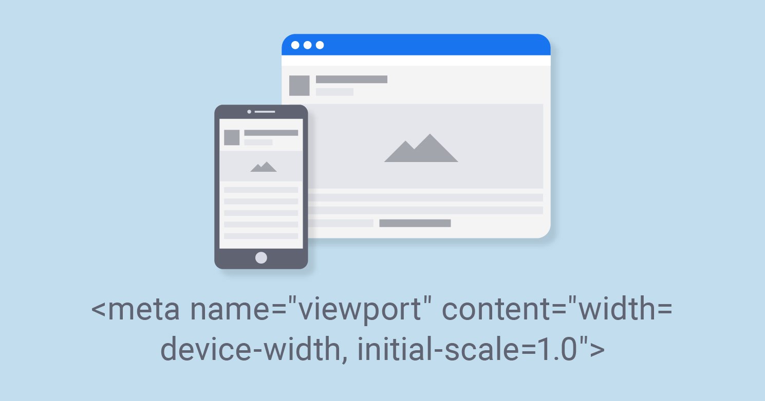
Responsive web design is about making web pages - that look suitable on all devices!A responsive web design will automatically modify for different screen sizes and viewports.{alertSuccess}
A few years ago, the website design was made, keeping in mind the screen sizes of desktops or laptops only; the fixed-width design was created because, at that time, the trend of small screen size devices was significantly less.
People use their desktops or computers to visit the website.
But ever since the development of mobile devices and smartphones has accelerated, the requirement for mobile version websites has increased.
Now people like to visit the website from their smartphones; in such a situation, you should make your site mobile-friendly as soon as possible.
{tocify} $title={Table of Contents}
How did Responsive Web Design start?
Along with the increase in the number of people using smartphones and mobile devices, a problem came that web designers needed to display a fixed-width website correctly on different-sized screens.
At first, to deal with this problem, web designers first found a way to create separate sites for desktop and mobile devices.
But this way was also not that easy; creating different versions for every screen size and resolution take lots of work.
If different versions of a website were made, then its maintenance cost would also increase, and different efforts would have to be made for the promotion and SEO ranking of separate sites.
Finally, In 2010, to solve all these problems, web designer Ethan Marcotte came up with a new way of website design, which he named Responsive Web Design (RWD).
What is Responsive Web Design?
Responsive web design is a process in which the website is designed to adjust its layout according to the screen size and orientation to make it look good on all devices (desktops, tablets, and phones.)
Why should your website be responsive?
According to the survey conducted by StatCounter.com in G20 countries, India has the maximum number of people (about 79%) using mobile devices to access the internet compared to other countries.
From this figure, you can understand that in today's time, you need to use a mobile-friendly website to reach your website to this 79% of people.
Advantages of Responsive website:
- Mobile traffic will increase: If your website is responsive, mobile visitors will definitely like it, which can also increase your website's traffic.
- The website's loading speed will increase: If you have optimized your website for mobile and tablets, then it will take a little time for webpages to open, and the site's speed will also improve.
- It's easy to manage: If you create separate sites for desktop and mobile, then it is obvious that managing two different sites will take a lot of work to promote. But if your website is responsive, then a single site will do your job.
- Google also recommends (RWD): Google likes RWD because the URL of the responsive website is the same for all devices, which makes it easy for Google to crawl, index, and understand.
Make a Web Design Responsive for All Devices
To make Websites Responsive, we can do complete coding ourselves, in which HTML and CSS can be used.
But now, many libraries and frameworks have been prepared for Responsive Web Designing.
These are used to make programming more accessible, which are as follows –
(Framework to create Responsive Websites)
1. Bootstrap
Nowadays, Bootstrap is most commonly used to create a responsive or mobile-friendly website. Bootstrap is a kind of framework. Using this, we can make the website responsive.
Bootstrap was designed by Twitter company employees Mark Otto and Jacob Thornton together.
Which was released as an open-source course on GitHub on 19 August 2011. To create a website, the web designer does not need to do much coding.
There is already a lot of code given in it, and there are many predefined classes of CSS in Bootstrap, which you can easily use on your page. You can use Bootstrap in two ways, first by downloading and second through CDN.
2. Skeleton
Skeleton is a simple, responsive, lightweight CSS framework. It is designed keeping mobile in mind. It is best for small projects as it only styles the major standard HTML elements.
It provides essential components like lists, forms, buttons, tables etc., to the developer. Its grid system fits all screen sizes like small, medium, and large.
3. Pure CSS
Pure CSS is great for small projects. It is specially designed for mobile devices. Web developers can quickly create excellent layouts using grids, menus, forms, buttons, etc., with its help. This keeps the file size small.
Elements created with Pure CSS look great on all screen sizes. New CSS rules can also be easily added to it.
4.UIKit
UIKit is a modular and responsive framework. It consists of many UI elements, which are either linked to HTML or JavaScript code.
It can create pixel-perfect web layouts and powerful, fast web interfaces. This is an in-built icon library. This is an excellent framework. It consists of some design elements.
Responsive Web Design Has 3 Major Elements:
According to Ethan Marcotte, RWD comprises three main parts: fluid grid, flexible images, and media queries.
If you are learning web designing, you should know about these three main parts of RWD.
So let us know about the three major elements of RWD today:
Fluid Grid
The size of most website elements is set in pixels, which is fixed.
However, according to the fluid grid, we use percentages instead of putting the website layout's height and width in pixels.
The size of Fluid Layout is defined in percentage so that it can resize its height-width according to any screen size.
Flexible Images
Only making a fluid layout will not work because unless all the components of the page are flexible, it will not be able to render correctly on the browser.
We also have to make images flexible so they can be adjusted on almost all screen sizes.
To create a flexible image, we have to define its size in percentage from CSS, for which max-width and max-height properties will have to be used.
img{max-width:100%;}{codeBox}
Media Queries
CSS Media queries are a fantastic feature through which we can display the layout differently on different media types like screen, print, handheld etc.
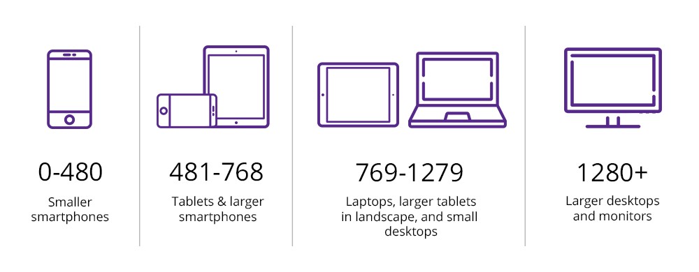
Using media queries, you can customize the website's layout according to different screen resolutions and orientations.
Example:
<style>.left, .right {float: left;width: 20%; /* The width is 20%, by default */}.main {float: left;width: 60%; /* The width is 60%, by default */}/* Use a media query to add a breakpoint at 800px: */@media screen and (max-width: 800px) {.left, .main, .right {width: 100%; /* The width is 100%, when the viewport is 800px or smaller */}}</style>{codeBox}
How to know whether the website is responsive or not?
If you want to know whether a website is responsive or not, then the easiest way is to open that site in the browser bar and then reduce or increase the size of the browser window.
If the components of the website shift and adjust according to the window size, then understand that the site is responsive.
For this work, you can also use the developer tools available on internet “Mobile-Friendly Test - Google Search Console.”
If you want to ask any RWD questions? or have something to say about this article, then definitely use the comment box below.{alertSuccess}
Conclusion:
Friends, according to my expertise, I have written complete information to help you with “HTML Responsive Web Design.” If this post is favourable for you or not, please tell me by commenting.
If you liked this post, do not forget to share it with your friends so they can get information about it.
You can ask us through comments if you still have questions or doubts, I will answer all your questions, and you can contact us for more information.
Please tell us through the comment section if you think we miss anything.


